These guidelines provide an opinionated way to implement drag and drop experiences with Pragmatic drag and drop for Atlassian interfaces. These guidelines work within web platform design constraints for drag and drop, and aim to optimise clarity and performance. Non-Atlassian consumers are welcome to use these guidelines, or create their own visual language for drag and drop. The core package does not have any baked in design opinions, but some of the optional packages embody these design choices.
We plan on soon making public our Figma tooling for Pragmatic drag and drop
Cards, lists, and other UI can often be dragged and reordered. Design clear and consistent drag and drop experiences in Atlassian products following these principles:
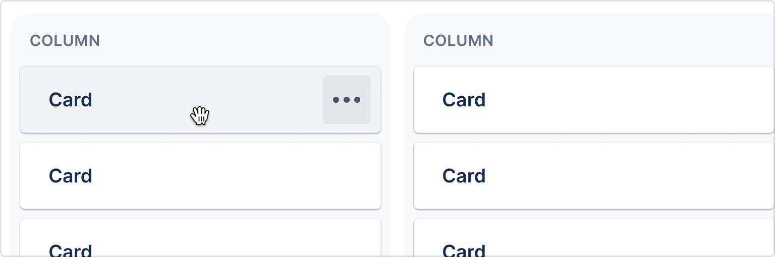
Use background colors, cursor changes, and icons to show what can be dragged. Choose the affordances based on on type of object and how important dragging is to the experience.
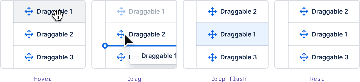
Some experiences, such cards in a board, imply that items can be dragged. Use background or border color changes on hover to show that items are interactive.
Combine hover background color changes with a change to the grab cursor (cursor:grab) to show that items can be moved. If the item has other interactions, you can delay the grab cursor till 800ms.
You can implement this behaviour just using CSS (no JS needed!)
.item:hover {
animation-duration: 0s;
animation-name: change-cursor;
animation-delay: 800ms;
animation-fill-mode: forwards;
}
@keyframes change-cursor {
to {
cursor: grab;
}
}
Implement with design tokens and cursors in code, or use the Figma kit (Atlassian only) for designs.
Drag icons help users understand what is draggable.

When dragging is the main action for an item, show the drag handle icon on the left of the item at all times. If dragging is possible on the item, but is not considered an important action, only show the drag handle icon on hover to simplify. Cards or other implied draggable entities (like trees or columns) do not require a drag handle icon, but should still have an action menu.
In general, make the whole item draggable wherever possible. If the item has lots of interactive parts, such as buttons or links on top of the item, you can also make the drag handle itself the only part that allows grab and drag interactions.
Use the drag handle component in code or drag handles in Figma (Atlassian only) for designs.
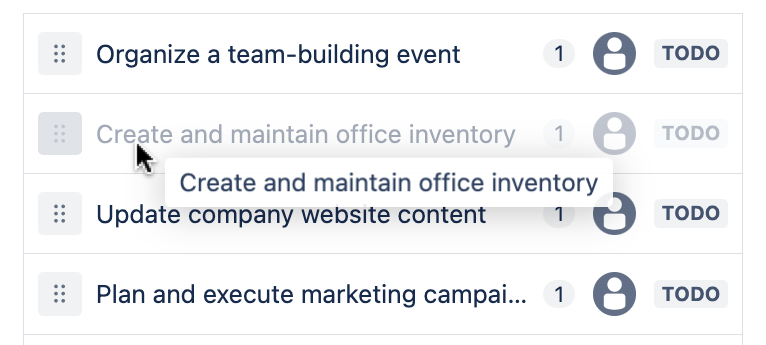
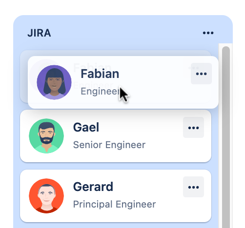
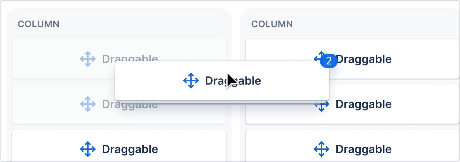
While an item is being dragged, it is important that you give clear feedback to the user about what is being dragged, and what will occur when the user completes the drag.
A drag preview is a representation of the item being dragged. Generally a drag preview is a picture of the item being dragged around the page, and not the draggable item itself.
When an item is small and simple, the drag preview can be an exact copy of the item being dragged. If an item is larger or more complex, you should simplify the drag preview.
Simplification suggestions:
- Use a maximum of three pieces of information in a preview
- Use a maximum preview size of
280px x 280pxto prevent super low drag preview opacity on Windows
Standard
Drag previews should generally be pushed away from the users pointer by space.100 vertically, and space.200 horizontally.
{
x: token('space.200', '16px'),
y: token('space.100', '8px'),
}
Cards
Cards are to be dragged from the point they're grabbed from (no offset).
Due to web platform constraints, we have limited control of the cursor during a drag operation. The cursor will generally be cursor:default during a drag operation.
More information about cursors.
While an item is being dragged, the original item should stay in place and dim to 40% opacity (opacity: 0.4) while the drag preview is being moved around.
For multi-item drag previews, use a stacked appearance with a badge indicating the number of items being dragged.
- Four or more small items such as list items should appear as a stacked preview under the first item. Less than four small items can appear separately where space allows (all items showing in the preview).
- Any more than one large item (card) should show as a stack with a badge indicating the number underneath.
Implement with native drag previews, or use the Figma kit (Atlassian only) in designs.
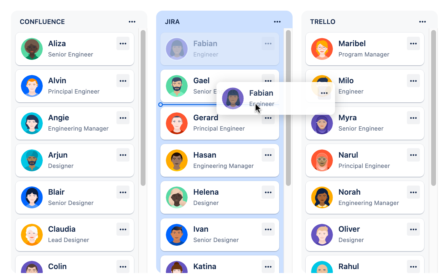
It is important to communicate during a drag operation, what the result of the operation will be. There are two signals you can use to indicate drop placement:
- Drop indicator (a line)
- Background color (
color.background.selected.hovered)
Drop indicator
The drop indicator line is used to communicate relative placement (for example, before or after an item in a list)
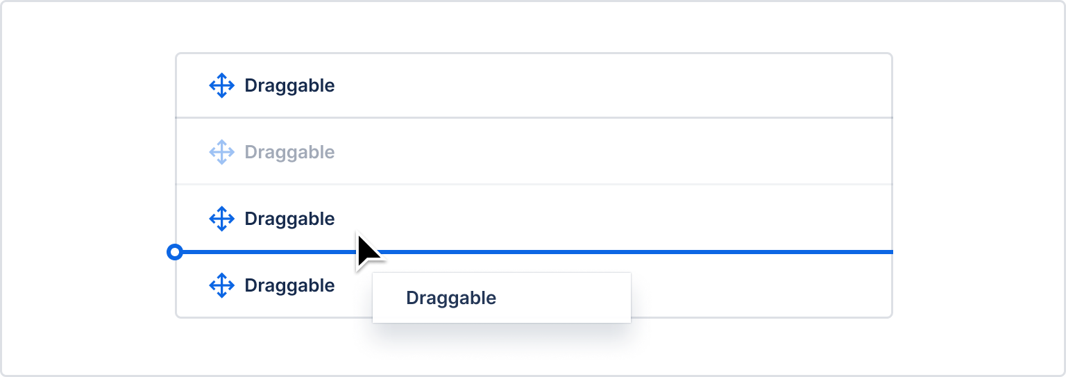
Drop indicator lines should have a terminal circle. The circle should overlap the far left of the element container where possible. For stacked items, the line should appear in the middle of the gap between the items.
A drop indicator line should not be used when a draggable item is being dragged over a droppable area where there is no relative placement possible (for example, dropping into an empty sibling list).
- Edge detection: determines when and where the drop indicator shows based on the location of the dragged item.
- React drop indicator: draw drop indicators
- Figma (Atlassian only)
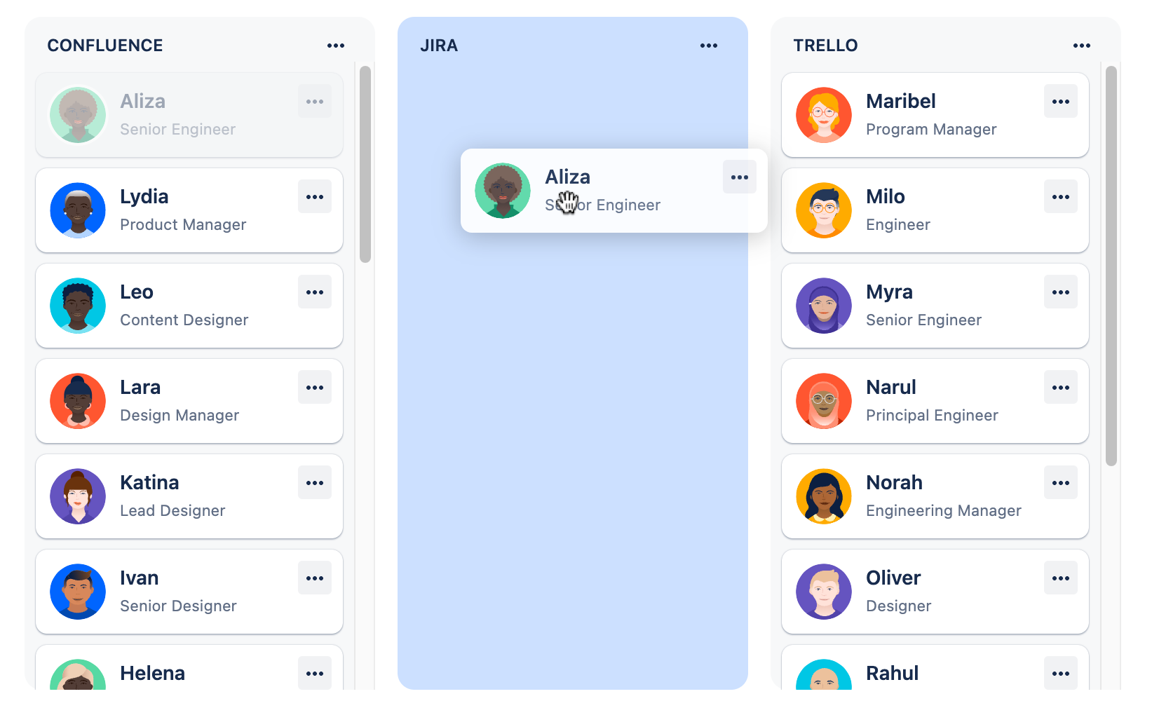
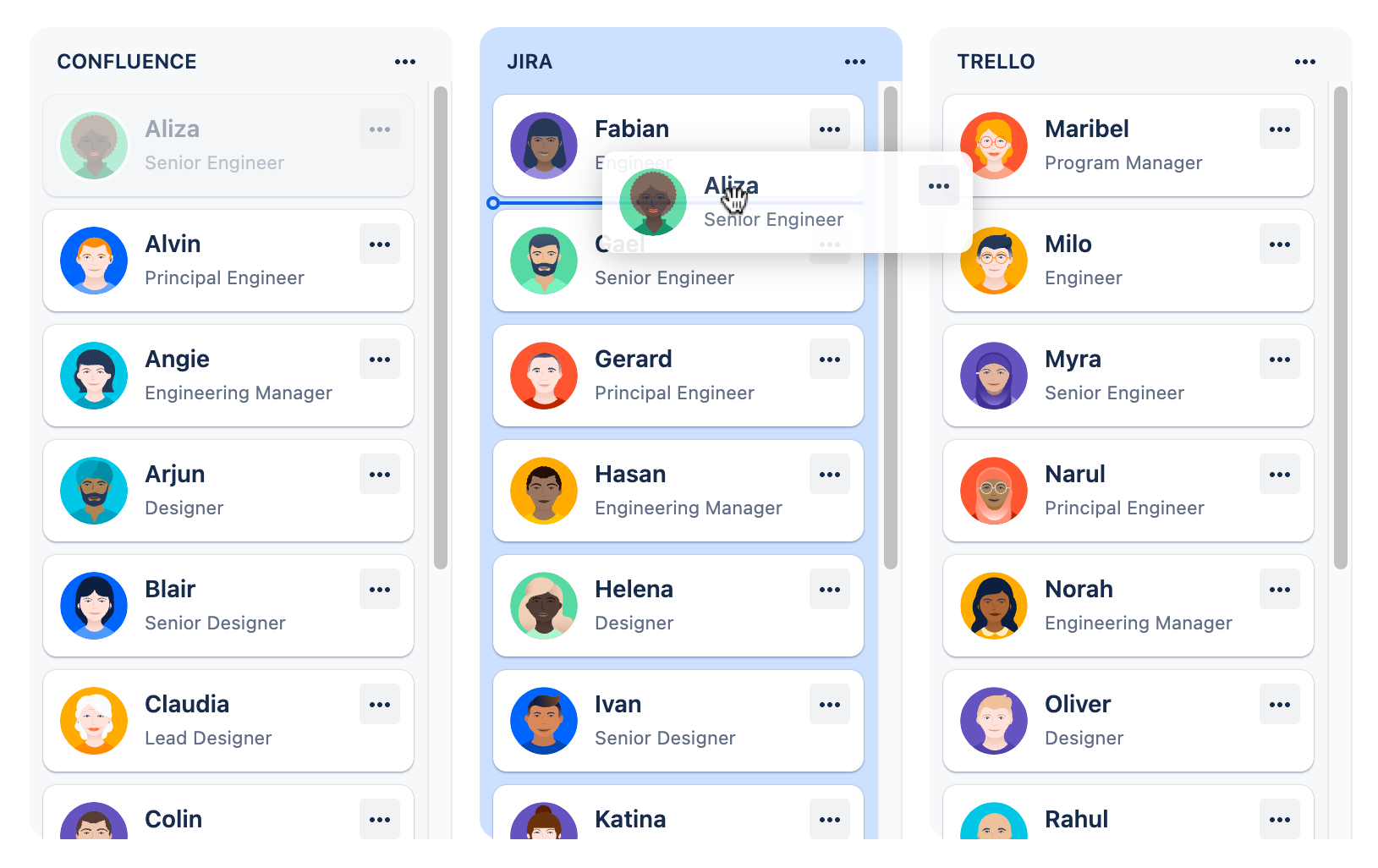
Background color
A background color change is used to communicate that an item will be placed within a particular droppable area. Background color changes should be used when there are multiple possible areas of the page a draggable item can be dropped on. The droppable area that the user is currently over should have its background color changed. A background color change should also occur when a draggable item starts in a droppable area, when there are multiple possible droppable areas.
Background color change animation:
- background color:
color.background.selected.hovered - easing:
cubic-bezier(0.15, 1.0, 0.3, 1.0)(import {easeInOut} from '@atlaskit/motion') - duration:
350ms(import {mediumDurationMs} from '@atlaskit/motion')
When draggable items can only be moved relatively within a single container, then no background color change should be used when the user is dragging something within the experience.
After a drop, the drag preview disappears and the original item should to it's new location. To improve clarity about what the user achieved, the background color of the moved item should flash once it has been moved.
Background color flash:
- color:
color.background.selected - easing:
cubic-bezier(0.25, 0.1, 0.25, 1.0)(not available in@atlaskit/motion) - duration:
700ms(import {largeDurationMs} from '@atlaskit/motion')
Implement this using flourish in code or show the color in the Figma kit (Atlassian only) for designs.
Be sure to see our accessibility guidelines
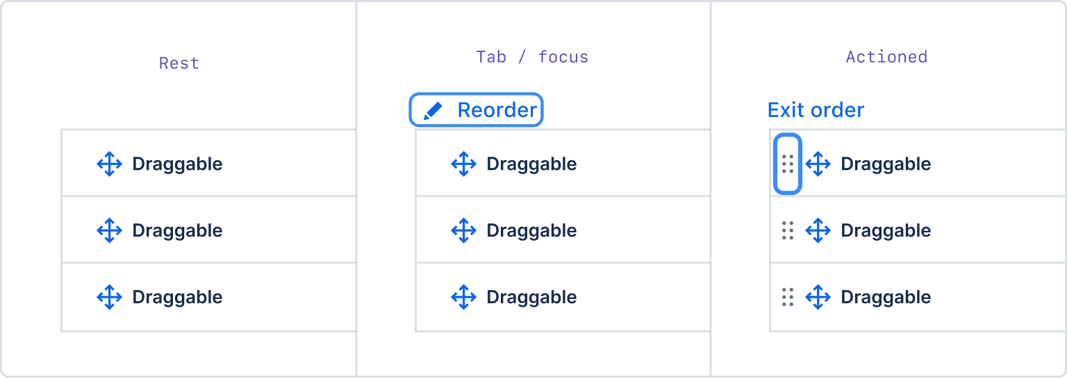
All draggable items should also have the ability to trigger the same outcomes using assistive technology friendly controls.
Please make drag handle icons visible (where possible) as this is a helpful signal for people that an item is draggable.
If the item already has a more actions (…) menu, put the move actions inside of the menu. This provides a keyboard accessible way to move items that doesn’t rely on mouse clicking and dragging.
If the entity does not have any more actions (…), make the drag handle icon into a menu button. When triggered, the drag handle button opens a menu that allows the users to move the item.
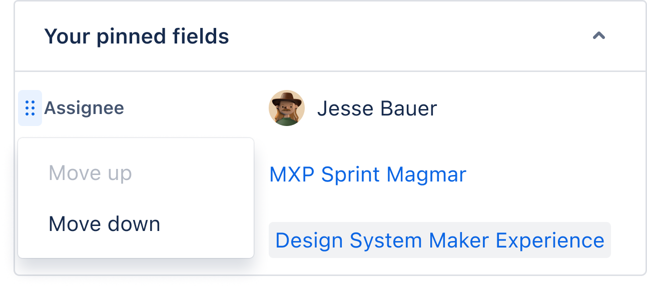
Use the drag handle menu component in code or the Figma kit drag handle menu (Atlassian only) in designs.
If an individual item does not have the ability to trigger actions, provide other ways to access movement controls on focus.
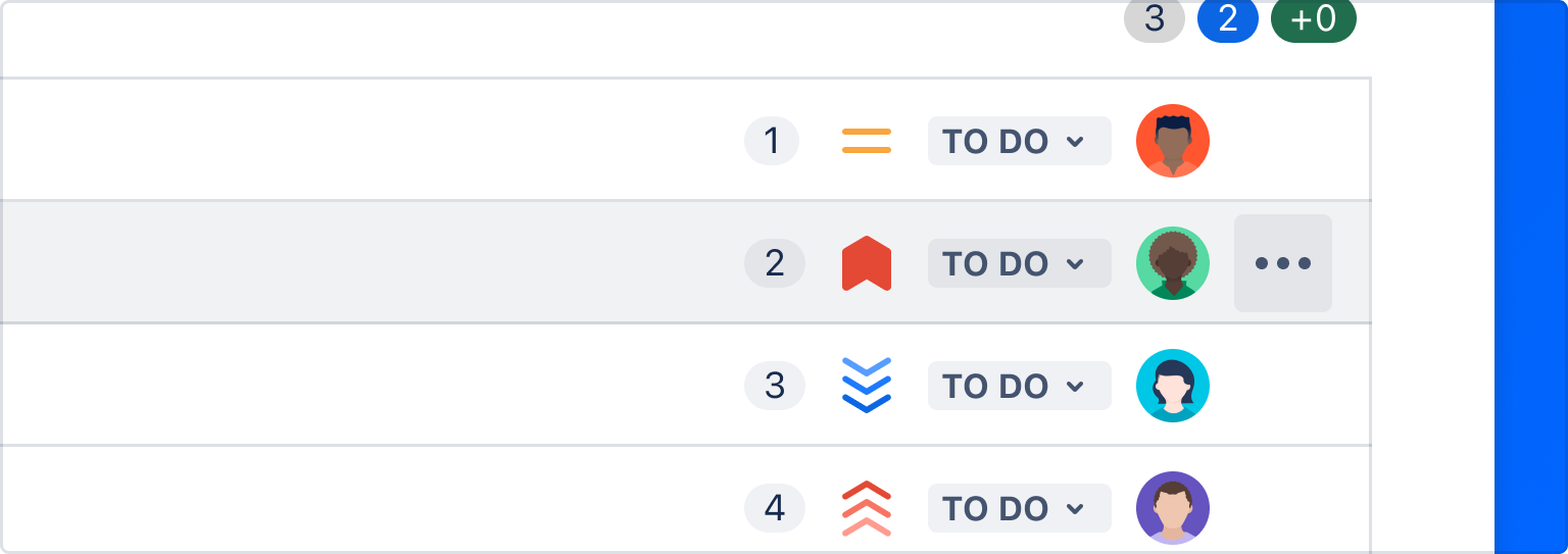
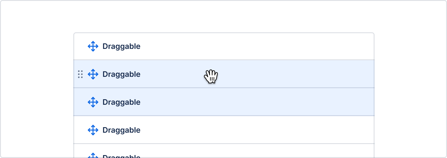
How to show when more than one element is selected to be dragged.
Use color.background.selected and color.border.selected to show the elements that have been selected, then change to the typical background color at 40% opacity once dragging begins. This shows where the objects are currently, and where they'll return if no drag location is chosen.
Because cards are larger, multiple cards should be stacked under the first card in the preview. Use a badge to show how many items are being moved.
Checkboxes are highly recommended to show when one or more items are selected.
Use the selected background color token to indicate which items have been selected. Use drag previews as usual, with all items being dragged in a column in the order they’d appear when dropped.
For more than three or four items, show a badge indicating the number and an implied stack beneath the top item.
| Visual treatment | Token or value | Implementation |
|---|---|---|
| Hover background color | color.background.neutral.hovered (or other hover color) | Design token |
| Hover border color | color.border.selected | Design token |
| Hover cursor | cursor:grab | Cursor:grab |
| Drag cursors | Reverts to pointer (browser limitation) | Cursor |
| Drag handle icon | color.icon.default (or other icon token with typical hover interaction colors on background) | Drag handle or Drag handle menu |
| Drag preview | 280px or smaller to avoid transparency issue | Native drag preview |
| Drop indicator stroke | 2px | React drop indicator |
| Drop indicator color | color.border.selected | React drop indicator, Design token |
| Drop indicator terminal circle | 8px diameter | React drop indicator |
| Drop area background color | color.background.selected.hovered | React drop indicator, Design token |
| Drop area background color animation | easing: cubic-bezier(0.15, 1.0, 0.3, 1.0) (import {easeInOut} from '@atlaskit/motion'), duration: 350ms (import {mediumDurationMs} from '@atlaskit/motion') | Motion |
| Drop flourish color change | color.background.selected | Flourish, Design token |
| Drop flourish color change animation | easing: cubic-bezier(0.25, 0.1, 0.25, 1.0) (not available in @atlaskit/motion), duration: 700ms (import {largeDurationMs} from '@atlaskit/motion') | Flourish, Motion |
Was this page helpful?
We use this feedback to improve our documentation.