Illustration is a key element of the brand system.
Our illustrations range from detailed hero images down to in-product spot images with a consistent narrative of practicality, optimism, and friendliness used throughout. This is accomplished through shape, color, softness, and curves to achieve an inviting, engaging experience.
Illustrations can:
make complex ideas more accessible
represent our brand - personality, voice, and platform - in an efficient and clear way
scale up or down depending on the context
affect tone and speak directly to users depending on the job to be done and the user's emotional state
help to tell stories and thoughtfully convey ideas - they should not be used as decoration or without consideration
We use illustration across marketing touchpoints to support a cohesive, clear, and consistent story from start to finish. It's almost always used to support copy, and should never distract or overshadow the key message. Illustration plays a more prominent role in marketing than in product in order to help tell stories, and is most commonly used in the following places:
websites, landing pages, microsites, service sites
presentations
demand generation assets (banner ads, etc)
email
social media
infographic
swag
Consider the following principles for how we want to be perceived through illustrations.
Our illustration style takes larger-than-life achievements and makes them human and relatable. Being bold means taking on massive goals, feeling empowered, and being confident that those goals are achievable. It's not about being loud, noisy, or over-the-top. It's about setting a goal and acknowledging the inherent complexity in getting things done. We use clean shapes, plenty of white space, and balanced color ratios to ensure that the scene never feels too chaotic.
Our illustrations feature future-forward narratives that center around teams working together to improve the world around them. The Atlassian illustration style reflects our belief that a team is capable of tackling any task, no matter how big or complex. Stylistically, bright color and a sense of low-gravity lend a lightness and buoyancy to our storytelling, driving home the point that when we work together, anything is achievable.
Though our illustration style is slightly fantastical, it should never feel impractical or naive. We reinforce the real-life nature of teamwork through perspective and depth. We add in 'wink' through slight tweaks to the dimension of people and things. We ensure that the illustration narrative is both inspiring and empowering, which means that we thoughtfully use metaphors (such as unicorns) when appropriate, as well as clear, literal representations of real-life concepts.
Atlassian illustrations can be broken down into several categories:
Hero illustrations are intended to tell more complex stories. This allows them to be more metaphorical and fantastical in nature. The viewer should feel a sense of teamwork, adventure, achievement, and optimism. In the majority of cases, a central, larger-than-life object should be surrounded by a team working to build, fix, and assemble. Hero illustrations contain more than three people and their complexity should vary depending on the intended size.
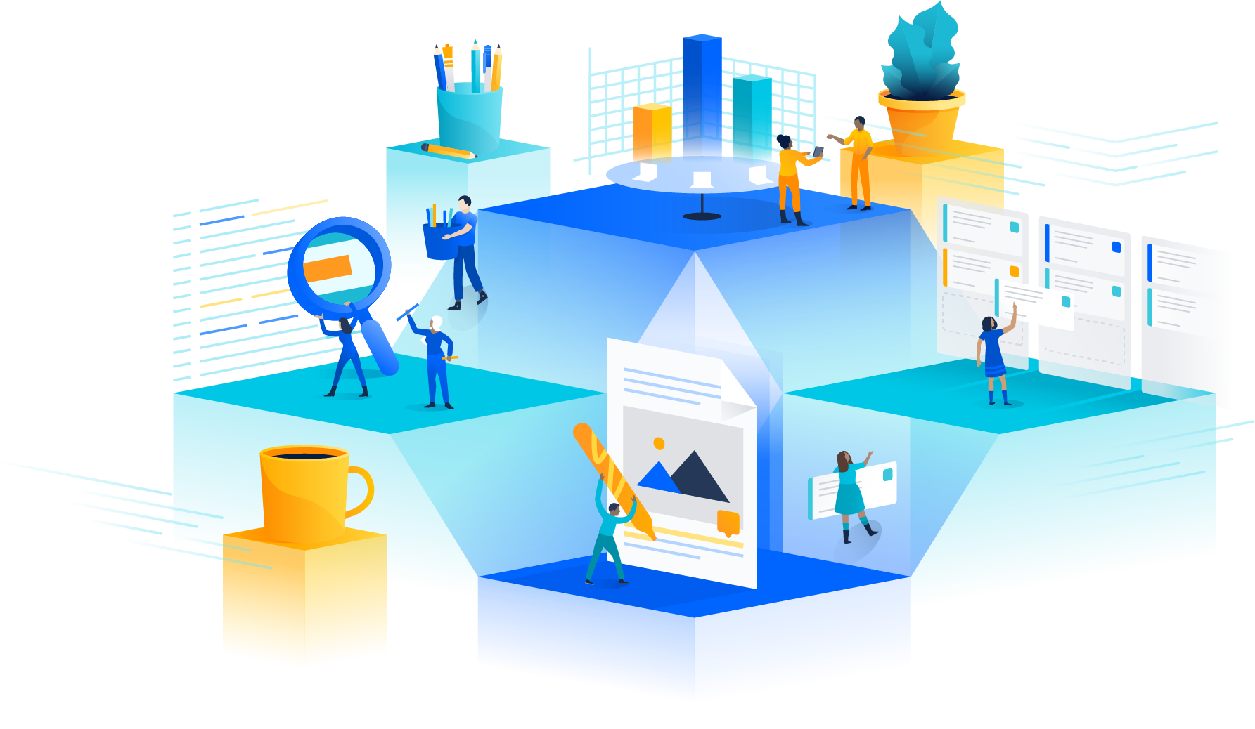
Spot heroes are slightly simplified versions of heroes, visually and metaphorically. These assets are perfect when you need to pack a punch with limited space. Often they are a slightly more literal representation of a single concept. Despite simplification, they still contain a small team working on or around a larger-than-life subject.

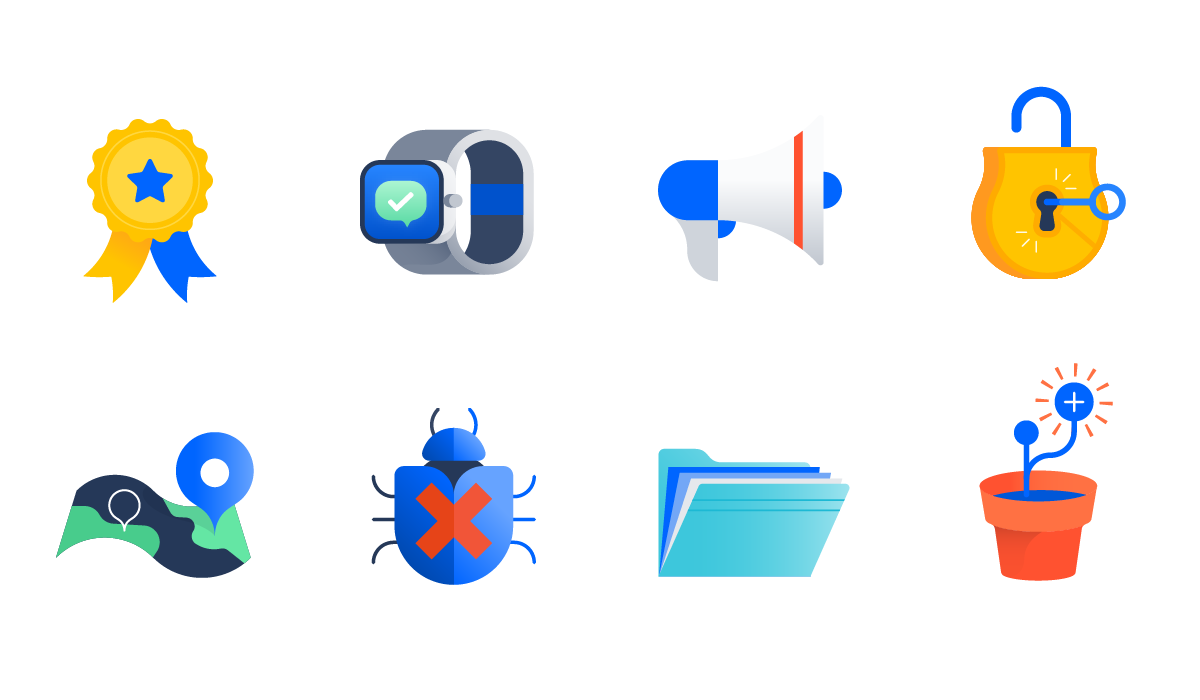
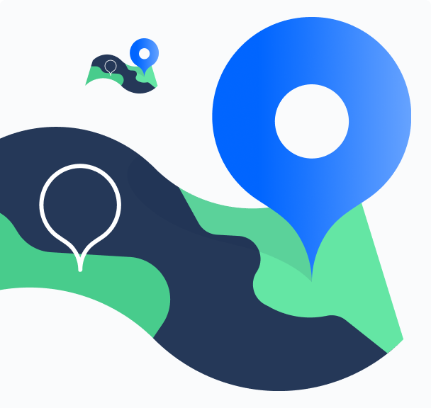
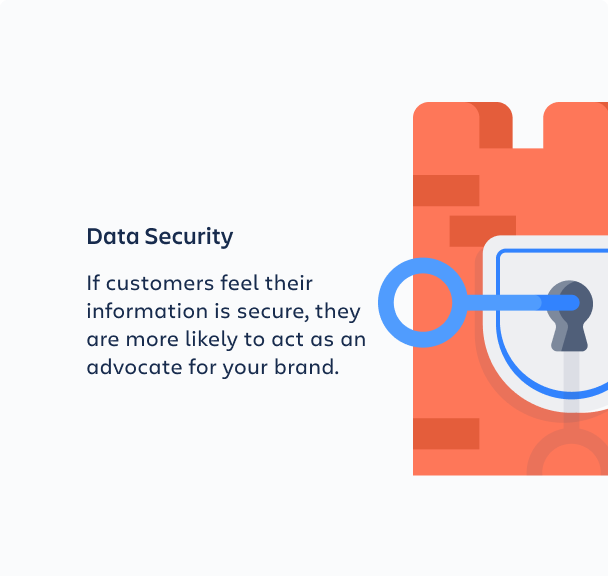
Spot illustrations are the simplest and most literal expression of a concept. Because they are often used in the product as an empty state, or in a composition with other spot illustrations, they are small and simple. They usually do not include any people but occasionally include some atmospheric background elements, depending on the design.
Meeples are a category in and of themselves and are created at both high and low fidelities for optimum flexibility. They can be used on their own, but are often combined with other illustrations.
Full-size meeples
When you talk about 'Bob', 'a customer', 'my team' or 'me', you need something more immediately relatable than low-fi pieces of a larger concept. For this reason, full-size meeples are more human and are designed to register as actual people versus concepts of people.

Simplified meeples
When space is tight, or a configuration calls for complexity, use simplified meeples so that individuals and teams can be displayed at a lower fidelity.

Meeple scenes
Sometimes, we need to depict individuals in environments that tell a story and set context. For this, you can use high-fi meeple scenes. These scenes set meeples in relatable environments, which are helpful when you are trying to show personal interactions.

Use these basic graphic design principals when creating compositions that use illustrations.

Do
Use pre-made compositions for meeples and scenes.

Don't
Use multiple illustrations and hack together illustrations.

Do
Show actions, progress, and relationships using dotted lines, arrows, and small text.

Don't
Pile illustrations on top of one another to show actions and relationships.

Do
Use illustrations at the recommended size.
Don't
Shrink illustrations down to icon size or increase beyond the prescribed size.

Do
Simplify your story and use plenty of white space around illustrations.
Don't
Make images disproportionately large to the rest of the content or use the image as a background element.
Was this page helpful?
We use this feedback to improve our documentation.